THE NEW:
One of my favorite websites for new and exciting fonts is: 1001 Free Fonts
www.1001freefonts.com
All of these fonts have been privately submitted and created from artists all over the world. Many of these fonts are a little difficult to read, or inappropriate for most occasions, but narrow in on a specific purpose. The font names feature a characteristic of reference to their origins. For example, the font named "Chinese Takeaway" is a collection of characters featuring a cliche oriental type of font we may see at a Chinese restaurant.


There are actually thousands of fonts on this site. They are divided into categories such as comic, horror, retro, and a variety of others. Any time period, culture, brand name font or classic fonts can be found on this website. Every package can be downloaded for either windows of mac and usually come with a folder of weight variations. Most fonts come with bold, italic, and underlined characters while others may not even produce a question mark.
Some of the more creative fonts feature little drawings or symbols that appear with the character if shift is held. For fonts that do not require capital letters, variations in form occur when a capital letter is attempted. In the world of digitizing fonts, the limits are endless as to what may be created.
THE OLD:
Before computers and high-tech designing programs and 1001freefonts.com, text was created by hand, and with pretty basic features. They were not so long ago known as typeface rather than fonts. Typefaces more specifically describe a certain type that belongs to a larger family or related set of fonts (http://en.wikipedia.org/wiki/Typeface)
Anatomy of typefaces used to be much simpler featuring serifs (the slight curves on the edges of the characters) and mono-spacing (where each character takes the same amount of space on a page). Hundreds of years ago, fonts were cast in lead alloys for printing with ink. The design of the fonts were nothing spectacular and were kept rather simple (as can be seen with 'times') since casting these alloys would be a task in itself. Printing with ink opens up so many more doors with font design then does creating a character alloy for every new idea.
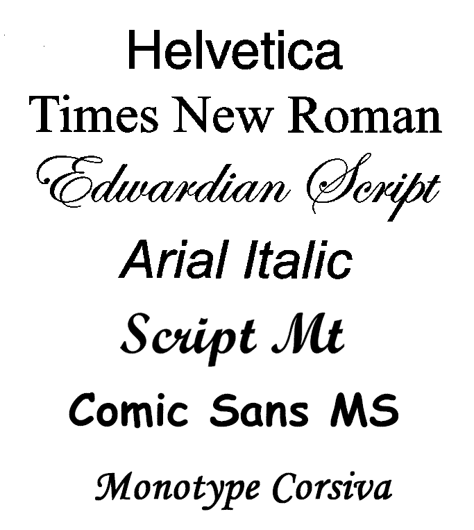
 A variation of fonts that can be seen in classic printed publications and still today.
Below are the basic fonts we use that are more traditional and easy to read. Most have some age to them:

No comments:
Post a Comment