David Carson is known as the master of typography. He is the expert of text design and placement. Typography is an art we witness everyday, whether it is a complex and abstract layout of words where it almost appears as illegible, or if we are reading a menu at a restaurant. The way text is laid out on a surface can really intrigue viewers and present imagery. Words can come right off the page and be put into any shape or form. Carson has had an extensive career and resume of projects and has built himself a reputation in the world of typographic design.
Carson was born in 1952 in Texas. It was not much longer until the family moved to New York; two extremely different lifestyles, which highly contributed to Carson’s outlook and influence. He grew up in a traveling family, experiencing a variety of cultures, climates, lifestyles, and design. Carson experienced many different types of pop-culture that were emerging around America. Photos were constantly taken everywhere to remember his sights. Seeing different pop-cultures is such a rich source of inspiration for design. Ever architecture and art varies in so many ways from country to country or even state to state. This remains true for tastes in music, clothing, and hobbies.
Creative talent had always been with young David, and his skills continued to develop with his experiences. In his college years, Carson really began to take interest in creative design when he took his first art course at the University of Arizona. From there on he studied more trends and developed his skills in preparation for the career world.
Carson’s client list and resume of creations is vast. The peak of his design work was influenced by the 1990’s grunge and skate/surf era. He was the art director of a short-lived magazine called Ray Gun Magazine. This project began in 1992 and lasted about 70 issues. It was the Alternative Rock and Surfer magazine of the early 90’s and mostly covered the dynamic and changing pop-culture of the Santa Monica, California area. At the time Punk and Grunge was hitting an all time high in popularity. Skateboarding and surfing were extremely “in.” The magazine featured experimental typographic design. This form of design was just being developed. Each page was a colorful collage of words and editorials covering abstract choices of subject matter. Carson’s designs were described as ahead of its time. The magazine covers featured different themes and typographical layouts each issue.
The typographical design Carson uses is so different and far out from other designs we witness in your typical magazine. These designs have a purpose to display information in shapes, layers, patterns, or anyway imaginable, sometimes to the point where only the creator can understand it. Carson uses type like a painter uses paint. You can create emotion and express the meaning of an article or picture through the placement of words alone. Abstract fonts and text are arranged in a certain way making a design within itself.
In Carson’s or other typographer’s design work, graphics are not used as much. Usually any pictures or silhouettes are background and the text is the main focus. Graphics are used to support the text, where as this may be the opposite if other forms of design. The point of typography, however, is to form the images with the words. Size, shape, and texture are key elements. Carson even arranges words upside-down or backwards. Colors vary from letter to letter even within the same words. He usually uses a variety of fonts on a given page. Depending on the mood, Carson is very successful with giving his fonts a “difficult to read,” messy and decomposed look. Flat and smooth text does not always present a certain feeling, especially for the grunge and surfer scene. Making letters look like they are breaking apart or have been roughed up is trendy.
Many of these elements are the complete opposite of principles used for creating more conservative works such as newsletters or brochures. Typographic design can be hit or miss with some people depending on their love for creativity. However, in the conservative designs, the focus is more on the information and the clear presentation of material.
After a style and a direction have been established, David Carson had begun dealing with a series of very large names in the business world. Carson had done designing and directing work for companies such as MTV, Atlantic Records, Citibank, Microsoft, AT&T, CNN, Quicksilver, and Pepsi to name a few. Carson was a director for commercials on the MTV channel and organized their presentation, giving them an abstract look from the rest of the music TV world. He had also designed the promotional can for Pepsi Cola, promoting Mundo Marino. In 1998, Microsoft had hired him to direct and design their entire advertising campaign for the year. This was a big year considering the Windows ‘98 operating system was released.
David Carson, as well as many other designers, all emphasis that a designer must know his or her audience. It is an obvious fact, but an extremely important one. Gathering ideas from pop-culture and trends can feed your thoughts for designing that can appeal to many. Carson also says to “Put yourself into the work.” Creating a reflection of yourself can give a design that much more emotion or texture. To keep these emotions new and unique from the last, one must keep an active life; gather inspiration by traveling. David Carson has inspired many through his work. Some may think that the creativity is simply a gift. However, becoming a unique designer can only come with passion.
Filmmaker, Photographer, and Motion Graphics Designer, Lyle Owerko has truly taken a passionate and inspirational approach towards fulfilling his goals of design. Design, as Owerko described, is and element that is performed to always improve the image of something. Design is merging with advertising as well as other fields. Everything is merging; from design with animations, photography, motion graphics etc. Creators are no longer specific to one area, but are now taking interest and need to be fluent in many arts. Adobe programs are today compatible with one another, where as this was not the case a decade ago. These programs, such as photoshop and illustrator for example, bring together drawing with photo editing.
Owerko emphasised that creative conciousness constantly changes depending on the activities you are invloved in or the environment around you. All of your influences merge into one in order to create your style. The most influencial things are Music, Light, Observation, Materials, Exploration, Seeing, and Interacting with people. Lyle mentioned throughout his lecture that the Punk Rock scene heavily influenced his attitude towards design work, which is DIY (Do It Yourself). Bands use myspace to self-promote. They record on their laptops in hotel rooms. They find small printing companies to print their own lines of shirts and make their own designs.
Taking pictures anywhere you go is also a very important thing to gather ideas and influence. Street Photography is a very popular hobby. These ideas one gathers stick and can be transposed into design much more creatively than gathering an idea from some form of design that has been done before.
Mashing is the merging of 2 things. Sounds self explanitory. Mashing is done in commercial work by merging pop-culture with regional culture. Lyle compared this to peanut butter and Chocolate.
Monotization is using your ideas to make money. Design is a fun way to express yourself. Why not make a few bucks entertaining people with it!
In the world of keyboard design, apparently not having any indication of letters or symbols is the new "in" thing for keyboard users. The new Das Keyboard features a sleek black design, glossy finish, a certain sound to it's typing, and a blank style of keys. This keyboard is designed to have its user learn how to touch-type in a small amount of time. The keyboard costs $129, which is cheap compared to some other crazy styles of computer desk enhancers. The keyboard just does not seem worth the money to me and you can learn to touch type on any keyboard with the right motivation.
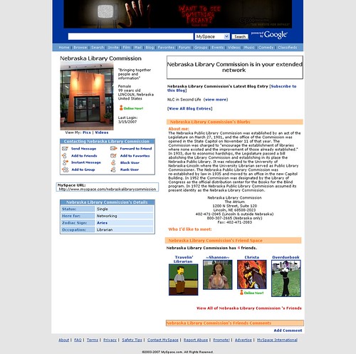
Myspace accounts are used more and more for music, promotion, and businesses. There is a common goal with all myspace users to promote something whether it be your band, your club, your artwork, or just your own good looks. Decorating the myspace pages and making them attractive towards viewers has become a business in itself. Many users are not capable of having the most elaborate designs.
Many small online businesses, made up of formaly or presently website designers, are advertising their skills to musicians and other people who want an attractive layout on their page. Groups such as Pearse Street Consulting (http://www.myspace.com/designformyspace) offer their knowledge of html and photoshop etc. to those interested in a custom myspace layout.
Bands such as Brighten have a very eye-catching design, unique to most other layouts one may find. You can view their page at http://www.myspace.com/wearebrighten There are bright colors and textures that also relate to the album art/theme they have established for themselves.
Below compares a typical myspace page to a totally revamped one:
Okay, so we've learned how to isolate the background and alter it with photoshop filters.
Btw, you can use the pen tool as a slower but easier way to trace the outline...better than the magnetic lasso tool.
After going around the face with the pen tool, make sure it is on the actual layer and that little "Paths" selection in the top left.
Go to paths (in the layer box) and drag into the mask option. Copy and Paste...
After selecting yourself (not the background) drag the layer selection to the "Create Layer Mask" option. Go to the new file we have made of a textured background. Copy the selection of yourself and paste into the new textured image to have a new background.
Edit edges appropriately.
Ethnographic research is the observation of any type of people around you whether they be in your class or in your dorm. The example we had was studying what consumers want to see when they enter the front of a store.
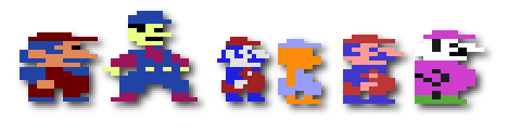
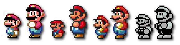
I came across this very interesting site showing the evolution of design in the world of the Super Mario Character. It is amazing to see it's drastic change from a 3-color, 8-bit, distorted character to a fully-rendered, smooth, 3D character in only over 20 years time. Some versions are actually terrible looking. Mario has been colored black, white, purple, yellow, orange, and many more.
In the 1980's, Mario's image was strictly pixelated and only a few, flat colors. In the early 90's and on, the mario design involved the same basic construction, but with color gradients, and sharper features that made the character come to life. Some of the earlier verions, such as Colecovision and Commedor 64 don't even closely resember the Mario we know and love today. The Mario featured in Donkey Kong closely resembed a fatter version of the first Super Mario World game.
The Ultimate Collection of Useful Photoshop Actions: http://www.smashingmagazine.com/2008/10/20/the-ultimate-collection-of-useful-photoshop-actions/ So after starting to use photoshop in class and mess with filters, lighting etc, it has been interesting to research to potential of the program. The actions shown in this article range from making the vintage photo lookto re-coloring hair, or anything really. With photoshop, it is simple to alter moods by colorizing an image. Light blues for more vintage, calm looks and warmer colors for perhaps a summer photo.
As you can see from the photo above, many different moods are created depending on the brightness, contrast, and dominant hue. Creating burned edges and adding graininess/fadedness. Sepia tone and black and white are simple not enough to serve as vintage now. Film distortion and grainy texture is a must. Even traces of finger prints!
These show how to select the background only and edit it with filters.
To give the picture a sharper focus on a face perhaps, select the background with the magnetic lasso tool and then apply a Guassian Blur to the background.
The eye picks out faces, words and numbers, and also differences in images.
using the regular lasso tool, select a few pixels into the hair/edge you are working with and a few pixels out into the background, and apply a Guassian blur to it as well to smooth the edges. Little touch ups can be made with the blue tool.
Today, Nusrat Durrani, the Senior Vice President and General Manager of MTV world visited the computer design class and spoke to us about his experiences, current projects, and MTV Iggy, a brand new globalization movement of music and artist brought together online and on its own tv show. Durrani's personal life and struggle to reach his goals was very interesting and unusual. Moving from India to persue his love of music and the MTV, Nusrat worked at the company at first as an intern, depsite his experience, and moved his way up. He helped develop mtv.com back in 1995, convincing the company to go forward with an online appraoch.
The job description of a Senior Vice President and General Manager encompasses just about everything. Your attention and comittment needs to be in all areas while constantly keeping in touch with everyone. Durrani deals with the interactive side of MTV, making deals with partners, developing new ways to unite fans with artists, and even visit schools and share these accomplishments. From hands on work to staff meetings, Durrani says he does it all.
Durrani talked about Iggy, a new website/TV show/facebook app. bringing music from around the world to share with anyone. Asian pop-culture is a beginning focus of Iggy, showing how Asian-American artists are trying to break into the mainstream and how they are looked upon in their home countries; a very interesting concept. MTV will no longer be restricted to promoting local hits and perhaps a handful of imported music, but can now introduce foreign pop-culture to anyone!
I personally enjoyed Nusrat Durrani's lecture very much. I specifically found the Iggy concept very interesting. His motivation and hard work was an inspiration and he seemed very open to new ideas and listening to new music no matter who its from.
I keep seeing more and more Retro design everywhere I look. The style is just so awesome, giving things that vintage, faded, lighter color look. Smashing Magazine had released some more tutorials on creating vintage/retro designs and here are some more samples of some neat ones I found.
I've seen design work done on guitar and bass cabinets before but I always thought it was custom and was not aware that there was a real market for such a service. A friend had turned me on to a small business, a myspace account, that makes custom art and screens for amplifiers. They've dealt with bands such as MxPx and Ludo. There are not any prices posted but I can imagine some of this work can be expensive.
With a backline of 3 amps, there are samples shown of bands that create an entire mural spanning the width of all 3 cabinets. Its a continuous picture. It is really interesting since its a type of art and design no one ordinarily thinks about. Here are some samples:
The purpose of photoshop is to manipulate images. This is one of the most popularly used programs of designers.
Work in 8x8 canvas size with a dpi of 300 (Print uses 300 or higher) Web uses 72 dpi. Save as a Photoshop file.
Next take a still picture from your youtube video. Hold Shift + Command + 4 drag the mouse across the picture. Make sure the resolution is the same for the clip.
Width at 1.75 inches. Image -> Crop -> bring into portrait.
Add text under the clip. Set the text to Helvetica at a font size of about 10 or 11. BOLD.
The text for example could be the director or a main actor. In my case it could be Bowser. Place that word under the picture. Then place your single word somewhere else and make the font bigger and different (serif or san serif...nothing too difficult to read).
The word should be centered generally and a larger pt. size.
Lighten or Darker whatever parts of the picture...color correction.
Turn the background into the layer so it can be manipulated.
Use Brightness/Contrast or Image -> Adjust -> Curves
Light tones = Highlights
Dark tones = Shadows
Middle tones = Mid tones
You can make the portrait warmer by going to color balance.
RGB (red, green, blue) can be countered with they're opposites CMY (Cyan, magenta, yellow).
When you select a portion of the picture to darken, it is called burning. Use the Burn Tool! (Dodge tool is the opposite, the sponge increases or decreases the color intensity).
Set the burn % to under 10 so that it does not burn too fast. Build up the tone change.
Detail in the shadows is important. Perhaps bring darker hair out by using the Dodge/Highlight option.
Render, Lighting Effects, Omni (or experiment with others).
When we think about a drum set, we may not always think about the type of finish on the drum shells, or the color of the hardware, or the type of wood used. There are so many gorgeous combinations of these elements, and many more, seen in the custom drum world. Custom drum shops are growing in popularity because they offer virtually anything a drummer with a little bit of money has at mind.
Graphic decals are common on drumsets nowadays while exotic and lacquer finishes give a higher status to one's set. Most drummers in national acts will have an entirely new customized drum set for every tour, usually featuring a color scheme with relevance to their latest album or the tour name. A drumset design reflect the personailty of its user and can be very important to the artist.
Here are a few sample finishes from Drum Workshop (www.dwdrums.com):
A Deep Blue into Sandstone exotic type drum finish with Brass Plated Hardware.
A Baby-Blue Lacquer Finish with standard chrome hardware and a transparent woodgrain.
Who would have thought back 30-60 years ago that their forms and styles of advertisement would be looked at as trendy in today's society. More and more designs reflect old-fashioned design styles because people like to see their advertisements in a format from before their time. Styles from the 50's and lates 70's/early 80's are very popular. Drawings of World War II era fighters or women are a popular piece used to give something a vintage look.
Here are two examples, the first being for an advertising agency website and the second two showing a friend's band's album covers featuring classic war characters and 40's/50's style settings:
The blackberry company has designed many phones with similar interfaces and a variety of sizes. The Blackberry Curve is much larger than the Blackberry Pearl, each featuring a different type of keyboard and texting technique. Many like it's software design because it keeps files, calendar dates, and all of your personal data/contacts organized. Even music, videos, pictures, and ringtones can be stored in their own folders.
Technology is moving towards a touch screen dominant direction. Like the iphones, the Blackberry Storm will feature a vertical, long touch screen and a store for games and applications. Blackberry is trying to move into the direction of modern, trendy, and fun while also allowing the user to stay business oriented.
The New Ipod Nano, developed with faster technology, brighter colors, and smoother structure, and a new on-screen layout. In my opinion, I was hoping the storage space could be a greater capacity, but the size of the actual unit is not large enough. From what I have seen, the new layout, which displays the artist, album art, and track listing is very tiny but out of the way. When viewed from the side, the new Ipod has an extremely thin look and smooth edges, allowing an easy slide into your pocket.
The accelerometer, found on the Ipod touches and some digital cameras, is found on the new nano, meaning that the image on the screen tilts whichever way it is being held. Aside from a new look and interface however, the screen size and video support softwares are pretty much the same. In my opinion, this new Ipod would be a nice and affordable purchase for someone looking for an upgrade, but for a consumer with the 2nd latest generation of Ipods, I would say even more changes are yet to come. So wait it out!
Below are some of my own personal Shirt Designs for my band Sweet Hollow Drive. I try to combined what some may see as trendy with my own style. I try to not fully go towards the brightest colors and the use of too many. I like to think of different wants to present our logo through the use of other things such as scrabble pieces or a cupcake holder.
Over the years of attending shows and purchasing merchandise from my favorite artists, I have noticed a strong trend change from shirt designs in the 90's and early 2000's to present day. Many band's today are following a trend where their T-shirts feature bright, neon colors and extremely large, and sometimes obnoxious designs. Typical silkscreen colors are sometimes replaced with metallic gold or silver inks, which cost a lot more to produce and a lot more towards the consumers. Sometimes "block" typography is used, placing the artist's name and perhaps a song lyrics in a block taking up the entire font side of a T-shirt.
Some artists are not even promoting their name/brand but instead, coming up with catchy/trendy phrases that can be associated with the band. Perhaps the cost to hire a designer is rising so much that strictly the use of fonts in a simple format has become commonplace.
Looking back on when band's used to produce a simple black and white shirt through their own silk screens, merch design has certainly come a long way. Looking at some shirt designs from The Offspring, a punk-rock band that has been around since the 80's, it is interesting to see their simplicity and basic color use for their designs.
Google has a history of apply simplicity to their design work in their browsers, search engines and other applications. The Article by Helen Walters says that they are "superficially simplistic" making navigation easy for any user. Designers do not only worry about the looks but also the functionality, and must remain loyal to their specific area in the project from start to finish.
For something like a Google browser where many different types of people with many different preferences will be using it, there needs to be designs that can satisfy the majority of the people. For example, pop-up notifications for downloads can be annoying to some but necessary for others. These options are all factors designers must be aware of.
Pictures of the browser being developed can be viewed on the link above!
Immediately a quote that caught my eye: "You have to take chances to get anywhere." This is stating how design and enticing viewers/consumers is a hit or miss process that has to be tried over and over. My personal attitude sometimes is that the design is what it is and people will accept it for the content and purpose and not always just the layout and color scheme. But design seems to have a more subtle impact if anything.
The book says that often, however, companies struggle to find an image that appeals to consumers. They try to develop a "flavor" perhaps something that consumers can "crave" that is different from the rest. It can be seen like food. When everything tastes the same, there is an equal chance that a consumer will go to you for a bite. But if your taste is unique and "spiced up" a bit, visitors are more frequent.
I make my life seem much busier than you may think is true, but I'm always doing something whether its promoting my music and designing graphics for the myspace, catching up with friends, homework, or anything really! Music and Business Marketing/Advertising are a big part of my life and something I am very passionate about. I'm in my Junior year at Hofstra University. Don't know what else to write at the moment but check back if your interested!