Eight Strategies for Design and Foresight:
http://www.core77.com/blog/featured_items/beyond_the_schlock_of_the_new_eight_strategies_for_design_and_foresight_by_kevin_mccullagh_10912.asp
An article from Core 77 by Kevin McCullagh. It describes 8 different ways we should look at the world around us, what is really "in" and what is not, in order to approach design in a proper way to appeal towards people. Point #3 he says is "Put Sociology before Technology." McCullagh says how when we think future, we shouldn't always think about hi-tech gadgets and vehicles and a space-age looking environment. Insted, focus on the changes in society, roles of genders and ethnicities and how they are changing. There is more to our future than technology.
Another point that stood out is #8 "Track and Tack." Here the author tells how companies sometimes consistantly ask their designers for the next image as popular trends shift from year to year. However, McCullagh says that it is wise to keep a current design and build it into your own trend, letting it represent the company for a number of years before changing an image.
How Great Design Makes People Love Your Company:
http://www.businessweek.com/innovate/content/sep2008/id2008093_827961.htm?chan=innovation_innovation+%2B+design_innovation+strategy
Being in a band, acting as a company for me, proper design on our advertisements and website is important and therefore I take a great interest in finding out the latest trends. The article states that design is even used by itself to build lasting relationships with customers. Apple, with their sleek and futuristic-designed products in an example of how they appeal to an entire population of young and creative users, partially through the product designs alone.
Obviously making a product attractive will guarantee a certain number of buyers. But we cannot forget about quality. Its the classic example of outer beauty and inner. I must say that Apple has put together quality products, both inside and out.
Tuesday, September 23, 2008
Calendar Design? Whoa!
Creative Calendar Designs:
http://www.smashingmagazine.com/2008/06/23/creative-calendar-designs/
Now this is a form of design I have never given much thought to before. Calendars! Some of which are designed so complex they are just difficult to read, yet provide a fun way of displaying numbers and dates. All lot of these designs don't even make much sense. Perhaps they are thrown together for other types of time keeps in other countries.

Even the submitters of this work had trouble figuring out how this calendar is read. They even tried adding white dots around Mondays.

Some calendars such as this one above are known as "Color Calendars." They use color and description to identify the month and type of weather associated with each season.
Monday, September 22, 2008
Brochure Design
I've been spending a lot of time on www.smashingmagazine.com still just browsing various designs and how they are applied in different ways, such as in brochures, which we are currently working on in class. This post I found is called:
Beautiful Brochures and Booklets:
http://www.smashingmagazine.com/2008/06/16/beautiful-brochures-and-booklets/
This post describes at first how brochures are used very often in the business and corporate world to give potential customers and clients a creative and brief glance at what they do. They are designed to be eye-catching and using many colors yet simple at the same time. Not too many of these samples show an extreme amount of detail. Again, another big part of the design in most of these brochures is creative typography and the proper layout and organization of texts. Color schemes are well thought out in a lot of these booklets. The first sample I show features browns, whites, and neon light blues.
Here are some samples of Brochures with simple yet dynamic design work:
Thursday, September 18, 2008
Typography In Motion
Also found on SmashingMagazine.com
There were some videos featuring typography in motion. Words and appearing and disappearing and lining up in different ways with many colors. There is some additional design included in these videos such as human interaction and animations that grow off from the text.
The designs are similar to my previous post with the typographic posters. In the videos, however, their construction is animated and shows how all the words fall in place like a puzzle. It is fun to watch how certain words are given human characteristics such as the Spanish word "Pelo" growing hair from it.
I couldn't find a link for the videos so click below to view them.
http://www.smashingmagazine.com/2007/11/19/monday-inspiration-typography-in-motion/
Wednesday, September 17, 2008
Ampersands!
Ampersands With Attitude:
http://www.smashingmagazine.com/2008/08/15/ampersands-with-attitude/
Who knew so much thought went into designing different types of ampersands, or "and" symbols. Designers have fun with creating this specific type of symbol because of its curves. Sometimes, the result doesn't even look very much like an ampersand at all. Some look more closely like an 'e' or the number 3. Most of the examples found on the link above share a similar type of boldness.


1. Closely resembles the Euro Symbol
2. More classic and traditional with an off-set feature.
3. Resembles a slanted number 8 with a kickstand.
http://www.smashingmagazine.com/2008/08/15/ampersands-with-attitude/
Who knew so much thought went into designing different types of ampersands, or "and" symbols. Designers have fun with creating this specific type of symbol because of its curves. Sometimes, the result doesn't even look very much like an ampersand at all. Some look more closely like an 'e' or the number 3. Most of the examples found on the link above share a similar type of boldness.
1. Closely resembles the Euro Symbol
2. More classic and traditional with an off-set feature.
3. Resembles a slanted number 8 with a kickstand.
Typography IS design!
This article/display shows how entire designs/advertisements can be composed entirely of type with little or no use of graphics or pictures:
Breathtaking Typographic Posters
http://www.smashingmagazine.com/2008/02/25/breathtaking-typographic-posters/
It appears to be very true; creating designs have so much to do with font types, size and amount of text throughout the [poster] and colors. Most of the example seen on this link feature information through awesome looking texts with only a background color and maybe some small designs and textures around the sides. There is not too much use of photography or graphics in any of these examples (with exceptions of course). Fonts are being turned into miniature graphics of there own, which means additional graphics are required less and less is type will take up the majority of a design.
Here are some interesting examples:


Tuesday, September 16, 2008
Corporate Fonts
60 Brilliant Typefaces For Corporate Design:
http://www.smashingmagazine.com/2008/03/20/60-brilliant-typefaces-for-corporate-design/
I came across this site that features the most eye-catching and modern typefaces used for corporate advertisements. Many of these styles can be traced towards advertisements we see on TV, billboards, magazine articles, or anywhere. These typefaces are for sale and are highly recommended for use in a business advertisement.
Each of these fonts comes with several weights that can range from extremely heavy to almost paper thin. The weight of a font in my opinion can change the meaning of a message by a large amount. There is a time and place for very thin weights, and the same goes for the boldest of fonts.
The introduction to this article states that the two items that must be considered in selecting these corporate fonts are legibility and good looks. Some appear a little fancy for anything beyond a header or title. Most however can be seen in sub-headers or even main content.

FF Utility: This font looks like it can be seen in a cellphone ad or anything having to do with new technology. Using all of the different weights with the same font in the same advertisement looks great without using so many fonts.

http://www.smashingmagazine.com/2008/03/20/60-brilliant-typefaces-for-corporate-design/
I came across this site that features the most eye-catching and modern typefaces used for corporate advertisements. Many of these styles can be traced towards advertisements we see on TV, billboards, magazine articles, or anywhere. These typefaces are for sale and are highly recommended for use in a business advertisement.
Each of these fonts comes with several weights that can range from extremely heavy to almost paper thin. The weight of a font in my opinion can change the meaning of a message by a large amount. There is a time and place for very thin weights, and the same goes for the boldest of fonts.
The introduction to this article states that the two items that must be considered in selecting these corporate fonts are legibility and good looks. Some appear a little fancy for anything beyond a header or title. Most however can be seen in sub-headers or even main content.
FF Utility: This font looks like it can be seen in a cellphone ad or anything having to do with new technology. Using all of the different weights with the same font in the same advertisement looks great without using so many fonts.
Marat: Something that can be found in a magazine used as a header, sub-header, and even body content. The appearance is described as "soft and friendly."

Region: Used most likely for European tourist/information and road signs.
Region: Used most likely for European tourist/information and road signs.
Quark Sketches/Notes for Brochure
Here is the Sketches I had drawn up for the covers and inside pages of my Richard Upjohn Brochure:


Notes for Quark Construction:


Notes for Quark Construction:
- Select New Quark Project. Draw guidelines at the 5 and 6 inch ruler marks with 1/2 inch boarders on the sides.
- Draw header text box (flush left: touching the left side of the boarder) Use the same font for the headers as the title fonts (20pt. give or take. for shorter headers)
- 2.5 inches wide for column text boxes (flush left and right). Copy and paste first text box to the other side to make it identical.
- Put your text into a word document to separate the content for each page and then copy into Quark text boxes.
- Text is NOT allowed to flow from page to page. Ideas must be designated to one page only. Use TIMES font (serifs, no sans serifs). **avoid broken words by hitting enter...break these up to give a rigid look.**
- Hit the link tool to bring remaining text to the second text box.
- Pictures must be exactly the length of either one or two columns.
- Captions: Smaller font size. Italic.
- Check through print outs.
- Draw 10% gray line between last text box and the sources section.
Sunday, September 14, 2008
Fonts NOW and THEN
My 2 blog posts this week will kind of be a past and present look at how fonts used to be and are being used.
THE NEW:
One of my favorite websites for new and exciting fonts is: 1001 Free Fonts
www.1001freefonts.com
All of these fonts have been privately submitted and created from artists all over the world. Many of these fonts are a little difficult to read, or inappropriate for most occasions, but narrow in on a specific purpose. The font names feature a characteristic of reference to their origins. For example, the font named "Chinese Takeaway" is a collection of characters featuring a cliche oriental type of font we may see at a Chinese restaurant.


There are actually thousands of fonts on this site. They are divided into categories such as comic, horror, retro, and a variety of others. Any time period, culture, brand name font or classic fonts can be found on this website. Every package can be downloaded for either windows of mac and usually come with a folder of weight variations. Most fonts come with bold, italic, and underlined characters while others may not even produce a question mark.
Some of the more creative fonts feature little drawings or symbols that appear with the character if shift is held. For fonts that do not require capital letters, variations in form occur when a capital letter is attempted. In the world of digitizing fonts, the limits are endless as to what may be created.
THE OLD:
Before computers and high-tech designing programs and 1001freefonts.com, text was created by hand, and with pretty basic features. They were not so long ago known as typeface rather than fonts. Typefaces more specifically describe a certain type that belongs to a larger family or related set of fonts (http://en.wikipedia.org/wiki/Typeface)
Anatomy of typefaces used to be much simpler featuring serifs (the slight curves on the edges of the characters) and mono-spacing (where each character takes the same amount of space on a page). Hundreds of years ago, fonts were cast in lead alloys for printing with ink. The design of the fonts were nothing spectacular and were kept rather simple (as can be seen with 'times') since casting these alloys would be a task in itself. Printing with ink opens up so many more doors with font design then does creating a character alloy for every new idea.
 A variation of fonts that can be seen in classic printed publications and still today.
Below are the basic fonts we use that are more traditional and easy to read. Most have some age to them:
THE NEW:
One of my favorite websites for new and exciting fonts is: 1001 Free Fonts
www.1001freefonts.com
All of these fonts have been privately submitted and created from artists all over the world. Many of these fonts are a little difficult to read, or inappropriate for most occasions, but narrow in on a specific purpose. The font names feature a characteristic of reference to their origins. For example, the font named "Chinese Takeaway" is a collection of characters featuring a cliche oriental type of font we may see at a Chinese restaurant.
There are actually thousands of fonts on this site. They are divided into categories such as comic, horror, retro, and a variety of others. Any time period, culture, brand name font or classic fonts can be found on this website. Every package can be downloaded for either windows of mac and usually come with a folder of weight variations. Most fonts come with bold, italic, and underlined characters while others may not even produce a question mark.
Some of the more creative fonts feature little drawings or symbols that appear with the character if shift is held. For fonts that do not require capital letters, variations in form occur when a capital letter is attempted. In the world of digitizing fonts, the limits are endless as to what may be created.
THE OLD:
Before computers and high-tech designing programs and 1001freefonts.com, text was created by hand, and with pretty basic features. They were not so long ago known as typeface rather than fonts. Typefaces more specifically describe a certain type that belongs to a larger family or related set of fonts (http://en.wikipedia.org/wiki/Typeface)
Anatomy of typefaces used to be much simpler featuring serifs (the slight curves on the edges of the characters) and mono-spacing (where each character takes the same amount of space on a page). Hundreds of years ago, fonts were cast in lead alloys for printing with ink. The design of the fonts were nothing spectacular and were kept rather simple (as can be seen with 'times') since casting these alloys would be a task in itself. Printing with ink opens up so many more doors with font design then does creating a character alloy for every new idea.
A variation of fonts that can be seen in classic printed publications and still today.Below are the basic fonts we use that are more traditional and easy to read. Most have some age to them:
Thursday, September 11, 2008
I don't know what title to use?
Notes:
Grids: Used to design and assemble products. Used as a mathematical and organizational contrsuct.
Usually websites keep their design for 3-5 years to keep their impression similar to how we keep our hair the same for a while because it is our style. The organization of corporations is similar to human beings. Corporations are citizens of society with legal responsibilities if a product they issue may harm someone. They get resources together to make production much more efficient and for cheaper prices.
Fonts and placement in politics can very much describe the attitude or subtle message concerning that political party. Comparing McCain's and Obama's sign logos show different texts that can trigger slightly different feelings.
Tuesday, September 9, 2008
Video Game and Music come together in Design
Guitar Hero 4 Drums Revealed and Tested!
http://kotaku.com/390363/guitar-hero-4-drums-revealed

The Designers of the Guitar Hero 4 drum controller must take into account everything from comfort to realism and accuracy. The design, although similar to the well-known RockBand controller, features only 3 drums and an added 2 elevated cymbals. The cymbals being elevated give a more realistic set up to gamers who want to want an experience very close to the real deal. Drummers such as Travis Barker and Chad Smith have been brought into the development department to record real-life motion capture to be used during game-play, analyze the set up, and test durability.
How hard a drummer can hit is a key factor in designing the drum and cymbal pads. They need to withstand heavy hitting while also being able to function properly and communicate dynamics to the game. Also the rate at which a drum pad can respond to rapid hits must be programs to handle fast moving sticks.
Here is a video showing some of the artists experimenting with the set:
Designers of High Fashion Enter the Age of High Tech:
http://www.nytimes.com/2008/09/08/technology/08trend.html?_r=1&adxnnl=1&oref=slogin&adxnnlx=1220979660-Cb2LxLDi/+XrRrhIYk04Qw
Fashion designers are continuously sharing and uploading ideas online. Basic clothing outlines are uploaded onto Stylesight (where a subscription costs $15000 for 20 members of a company) and fabrics as well as templates can be networked to different designers and worked with in different ways. Designers, using this network, can search a huge database of tagged images for any style. The types of shirts or jeans people wear in another country can be researched as well as specific patterns that were popular during a certain decade.
STYLESIGHT is a website that connects fashion designers with the rest of the world without having to travel or directly communicate with other creators.

Client trends may be stored too in order to track how fashion changes with time and what people are more or less willing to purchase. Companies such as Macy's and Target use Stylesight to gather and share basic ideas on current fads. Once researchers conclude projected trends for the upcoming season, the databases are updated again. Designers may separate by colors, patterns, fabrics, sketches; anything.
Here is a link to the actually Stylesight community:
http://www.stylesight.com/
http://kotaku.com/390363/guitar-hero-4-drums-revealed
The Designers of the Guitar Hero 4 drum controller must take into account everything from comfort to realism and accuracy. The design, although similar to the well-known RockBand controller, features only 3 drums and an added 2 elevated cymbals. The cymbals being elevated give a more realistic set up to gamers who want to want an experience very close to the real deal. Drummers such as Travis Barker and Chad Smith have been brought into the development department to record real-life motion capture to be used during game-play, analyze the set up, and test durability.
How hard a drummer can hit is a key factor in designing the drum and cymbal pads. They need to withstand heavy hitting while also being able to function properly and communicate dynamics to the game. Also the rate at which a drum pad can respond to rapid hits must be programs to handle fast moving sticks.
Here is a video showing some of the artists experimenting with the set:
Designers of High Fashion Enter the Age of High Tech:
http://www.nytimes.com/2008/09/08/technology/08trend.html?_r=1&adxnnl=1&oref=slogin&adxnnlx=1220979660-Cb2LxLDi/+XrRrhIYk04Qw
Fashion designers are continuously sharing and uploading ideas online. Basic clothing outlines are uploaded onto Stylesight (where a subscription costs $15000 for 20 members of a company) and fabrics as well as templates can be networked to different designers and worked with in different ways. Designers, using this network, can search a huge database of tagged images for any style. The types of shirts or jeans people wear in another country can be researched as well as specific patterns that were popular during a certain decade.
STYLESIGHT is a website that connects fashion designers with the rest of the world without having to travel or directly communicate with other creators.
Client trends may be stored too in order to track how fashion changes with time and what people are more or less willing to purchase. Companies such as Macy's and Target use Stylesight to gather and share basic ideas on current fads. Once researchers conclude projected trends for the upcoming season, the databases are updated again. Designers may separate by colors, patterns, fabrics, sketches; anything.
Here is a link to the actually Stylesight community:
http://www.stylesight.com/
Fonts fonts and more fonts!
Notes:
Innovation is composed of:
-The use imagination for creation (creating a skin on the bmw)
-Direct application in the commercial world of society. innovation must be applied to something with a pragmatic application. Something people desire. Beauty applied to a practical problem. ex) how to make a hosptial experience more enjoyable through design or a website a more enjoyable experience.
-Fine art, personalized imagination side.
-Energy Star hard drives, going green on design of technologies such as mass storage devices.
-Data mining is looking for unexpected trends and truths in large amount of data (such as finding pictures of baseball bats flying into stands and collecting them).
-Choosing your own context for certain categories.
Topography and the design that goes with the creation of each font.
Suggestive meaning by the way each letter appears.
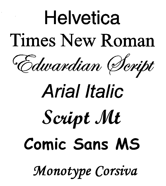
SERIF means fonts with little hooks on them such as italics and SANS represents the basic plain fonts.
TIMES NEW ROMAN is 2000 years old. The shapes were designed through the use of their tools available, like the chisel. The use of this gave the fonts their little curves (serif). This font is very easily readable with small letters to most people.
WEIGHTS are what is used to describe bolds and italics. Light, Medium, thin, super thin, strong, etc...Heavy, and black...both bolder than bold.
GILLSANS is a font designed in the 1930's as the type for the London subway system.
HELVETICA is used for corporate communication.
FUTURA is used by Volkswagon.
CENTURY SCHOOLBOOK used for teaching and schoolbooks; easy to read for young readers.
Innovation is composed of:
-The use imagination for creation (creating a skin on the bmw)
-Direct application in the commercial world of society. innovation must be applied to something with a pragmatic application. Something people desire. Beauty applied to a practical problem. ex) how to make a hosptial experience more enjoyable through design or a website a more enjoyable experience.
-Fine art, personalized imagination side.
-Energy Star hard drives, going green on design of technologies such as mass storage devices.
-Data mining is looking for unexpected trends and truths in large amount of data (such as finding pictures of baseball bats flying into stands and collecting them).
-Choosing your own context for certain categories.
Topography and the design that goes with the creation of each font.
Suggestive meaning by the way each letter appears.
SERIF means fonts with little hooks on them such as italics and SANS represents the basic plain fonts.
TIMES NEW ROMAN is 2000 years old. The shapes were designed through the use of their tools available, like the chisel. The use of this gave the fonts their little curves (serif). This font is very easily readable with small letters to most people.
WEIGHTS are what is used to describe bolds and italics. Light, Medium, thin, super thin, strong, etc...Heavy, and black...both bolder than bold.
GILLSANS is a font designed in the 1930's as the type for the London subway system.
HELVETICA is used for corporate communication.
FUTURA is used by Volkswagon.
CENTURY SCHOOLBOOK used for teaching and schoolbooks; easy to read for young readers.
Thursday, September 4, 2008
Design in Music & Technology
BusinessWeek Articles:
$92,000 for Rolling Stones Tongue Logo
http://www.businessweek.com/innovate/content/sep2008/id2008093_100991.htm?chan=innovation_innovation+%2B+design_top+stories
This article illustrates how a simple yet thought out logo which holds a connection to the source (in this case, The Rolling Stones) can turn into an icon for rockers around the world. The articles states that the tongue symbolizes a rebellious personality and "anti-authoritarianism." The type of rocker crowd that listened to the Stone's music could associate with the message being conveyed by the mouth and tongue. This is similar to the article I had read yesterday on simplicity of design. There is a fear, says the designer John Pasche, that music design work is dying with the lack of packaging and an increase in downloads online.
Core77:
New Bottle for Elmer's, and Everyone Else
http://www.core77.com/blog/materials/new_bottle_for_elmers_and_everyone_else_11011.asp
Elmer's Glue, for just about the first time in their history, have changed the designs of the product labels, bottles, and spouts. The old spout design in my opinion was annoying to say the least, being that it would always seal up after every use and become impossible to re-open once the excess glue dried. Their goal is to design newer labels that distinguish different glue types more easily.
Richard Upjohn: Draft
Richard Upjohn: Reviving Gothic Architecture
Architectural design of churches and cathedrals is an art that has been practiced for thousands of years and continuously recreates ancient styles of construct. The
Upjohn’s most famous architectural success was the re-building of the Trinity Church in New York City, featuring classic Gothic design with upward pointing towers topped with crosses, detailed edges with carvings, and castle-like walls. The towers were designed to symbolize pointing upward towards heaven. Some of Upjohn’s other works included the Church of Holy Apostles, the Church of the Holy Communion, and the Church of Ascension, all located within the NYC/Brooklyn area. Although his specialty was in gothic restoration, Upjohn in his career had also been responsible for contributing architectural work towards schools and colleges, mansions, and even houses including his own.
Richard Upjohn, as stated in his biography by Everard Upjohn, had had too many jobs in his career worth noting and that listing them would be impossible. Early in his life, Upjohn had worked in the cabinetmaking and draftsmanship fields. His earliest construction took place in
Many of the churches Richard Upjohn had worked on can almost be seen as identical to some European churches and cathedrals which are of course much older and original. It goes to show that ancient styles of architecture in churches do not evolve and change; if anything, our local churches are progressively simplified in stature. The construction and architecture of churches is an art developed to glorify the Lord and Heaven, a factor which is progressively lacking in today’s world.Upjohn's work can be be seen throughout the city of New York and Brooklyn. Large crowds continue to attend services at his churches and admire the broad exterior and elaborate interior. Richard Upjohn had a motivation to create a beautiful setting for places of worship.
Class #2 / More info on my Brochure
Notes:
More Research for the Brochure:
Below are links to the photos of Upjohn and his churches:
http://i57.photobucket.com/albums/g231/DefyDestination8/Richard.jpg
http://i57.photobucket.com/albums/g231/DefyDestination8/TrinityChurchDrawing.jpg
http://i57.photobucket.com/albums/g231/DefyDestination8/TrinityChurchInterior.jpg
http://i57.photobucket.com/albums/g231/DefyDestination8/TrinityChurchOriginalDrawing.jpg
http://i57.photobucket.com/albums/g231/DefyDestination8/TrinityChurch.jpg
http://i57.photobucket.com/albums/g231/DefyDestination8/stpaulschurch-buffalo.jpg
Sub-head: descriptive and short, punchy tag-line for the brochure. 1-3 words perhaps.
For under the Title.
-Scan some images (maybe 9-10) including a portrait.
-Platton: the glass plate on a scanner (profession designer term)
-Mies Van Der Rohe: German Architect that says that God is in the details meaning that creating a perfect recreation of an image needs a perfect touch.
Moira Lines/Patterns: The darker and lighter spots on a scanned image which is created when two groups of dots clash...this can be fixed by blurring a little bit.
Blog Presentations:
Design strategies created from future backwards.
-Says designers usually just try to do what's popular and trendy while at the same time this is very narrow minded.
-Instead of basing a style off of everyone else's and developing the same type of design or product, it should be based more on what people actually want.
(this can be seen in the music merch business how most of today's shirts feature brighter colors such as purples, pinks, yellows and neon blues, and bigger letters and images)
Nano: teeny tiny: 1 billionth of a meter
Micron: 1 millionth of a meter (39 millionths of an inch)
More Research for the Brochure:
-Upjohn's architectural style focused around Gothic construction. Many of his churches show similar ideas from older european cathedral and church construct styles.
-His earliest construction was performed on private houses in Maine.
-I will describe Upjohn's progress from these houses to the rebuilding of the Trinity Church; a typical look when we think of Gothic Architecture.
-Gothic influence in Upjohn's work can also be seen in St. John's Church in Maine designed in the early 1800's.
-The pointy structures on the middle and boarder of the churches are pointing in the direction of Heaven and generally have crosses on top of them.
-Church of the Holy Communion
-Church of Holy Apostles
-The Church of Ascension
-Trinity Church
Life: January 1802 - August 1878
President of American Institute for Architects from 1857 to 1876
Below are links to the photos of Upjohn and his churches:
http://i57.photobucket.com/albums/g231/DefyDestination8/Richard.jpg
http://i57.photobucket.com/albums/g231/DefyDestination8/TrinityChurchDrawing.jpg
http://i57.photobucket.com/albums/g231/DefyDestination8/TrinityChurchInterior.jpg
http://i57.photobucket.com/albums/g231/DefyDestination8/TrinityChurchOriginalDrawing.jpg
http://i57.photobucket.com/albums/g231/DefyDestination8/TrinityChurch.jpg
http://i57.photobucket.com/albums/g231/DefyDestination8/stpaulschurch-buffalo.jpg
Tuesday, September 2, 2008
The First Post
Notes:
Well today was the first day of classes. First day of Computer Graphics class. It was mostly introductory but I took a few notes down. Here is just a few key things:
-The forms of design we will be looking at include graphic/web/interactive, fashion, architect, service, and motion graphic design (media/TV)
-Service Design includes the entire experience or relationship between viewers and a product or idea. This may involve customer service and communication, the website design, a product etc.
-Designing is about what not to do. I guess this can mean you have to understand who will be viewing and how to captivate them while not over-designing or using unnecessary material.
ex) There are 14000 fonts. Most of the time simpler is better. Only about 10 are used such as Times New Roman. Sometimes I've noticed a plain font with changes in sizes and colors can be just as interesting as a bizarre script-like font.
-72dpi (web images) look good on computer screens but will not print well.
-300dpi is the general resolution used to print clear graphics
-Magazines can use up to 1000dpi for covers.
-I've heard billboards and large outdoor ads use up to 1600+
Reviews:
For my 2 reviews in the graphic design world:
The 10 Commandments of Web Design: by Matt Vella
http://www.businessweek.com/innovate/content/jun2008/id20080623_750025.htm
I found the 10 commandments very interesting and something I find myself aware of while I work on my band's myspace page. The article frowns upon such elements as clutter, abused flash design, and simply too much graphic work. Less is more sometimes and content will always be more important that the designs that accompany it. Although eye-catching graphics and media may bring viewers back to a website, all content and no informational foundation isn't the best idea.
What is Exhibition Design?
http://www.core77.com/blog/book_reviews/book_review_what_is_exhibition_design_by_jan_lorenc_lee_skolnick_craig_berger_9446.asp
This short article introduced another type of design that I had not thought of before; the design of exhibitions, museums and displays. Although this article only describes the contents of a book on the subject, it can make one appreciate the thought and creativity put into bringing out the desired feeling behind a presentation. For example, a fossil display from prehistoric times may be decorated and presented in a mysterious, dim lighted room.
Research:
My first Computer Graphics assignment (the brochure) will be on the well-known church and cathedral designing Architect Richard Upjohn. The Book I have found in the library is entitled "Richard Upjohn: Architect and Churchman." There is also more information and images on Upjohn at http://nyc-architecture.com/ARCH/ARCH-RichardMUpjohn.htm
There are some pictures to scan in the book, as well as some web images.
Upjohn is most famous for his architecture in the Trinity Church as well as many other NYC churches. His skills began with cabinetmaking and draftsmanship.
There is much to be read in this book but my 3 main topics in this brochure will be:
-How Upjohn developed his career.
-How Upjohn created a sense of unique style in his church design.
-His most popular architectural works.
Subscribe to:
Posts (Atom)
