I came across this very interesting site showing the evolution of design in the world of the Super Mario Character. It is amazing to see it's drastic change from a 3-color, 8-bit, distorted character to a fully-rendered, smooth, 3D character in only over 20 years time. Some versions are actually terrible looking. Mario has been colored black, white, purple, yellow, orange, and many more.
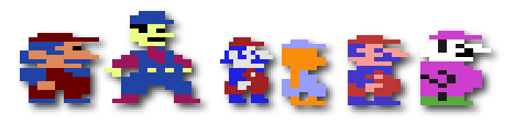
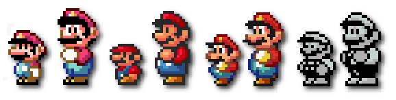
In the 1980's, Mario's image was strictly pixelated and only a few, flat colors. In the early 90's and on, the mario design involved the same basic construction, but with color gradients, and sharper features that made the character come to life. Some of the earlier verions, such as Colecovision and Commedor 64 don't even closely resember the Mario we know and love today. The Mario featured in Donkey Kong closely resembed a fatter version of the first Super Mario World game.

No comments:
Post a Comment